
HOMEPAGE REDESIGN
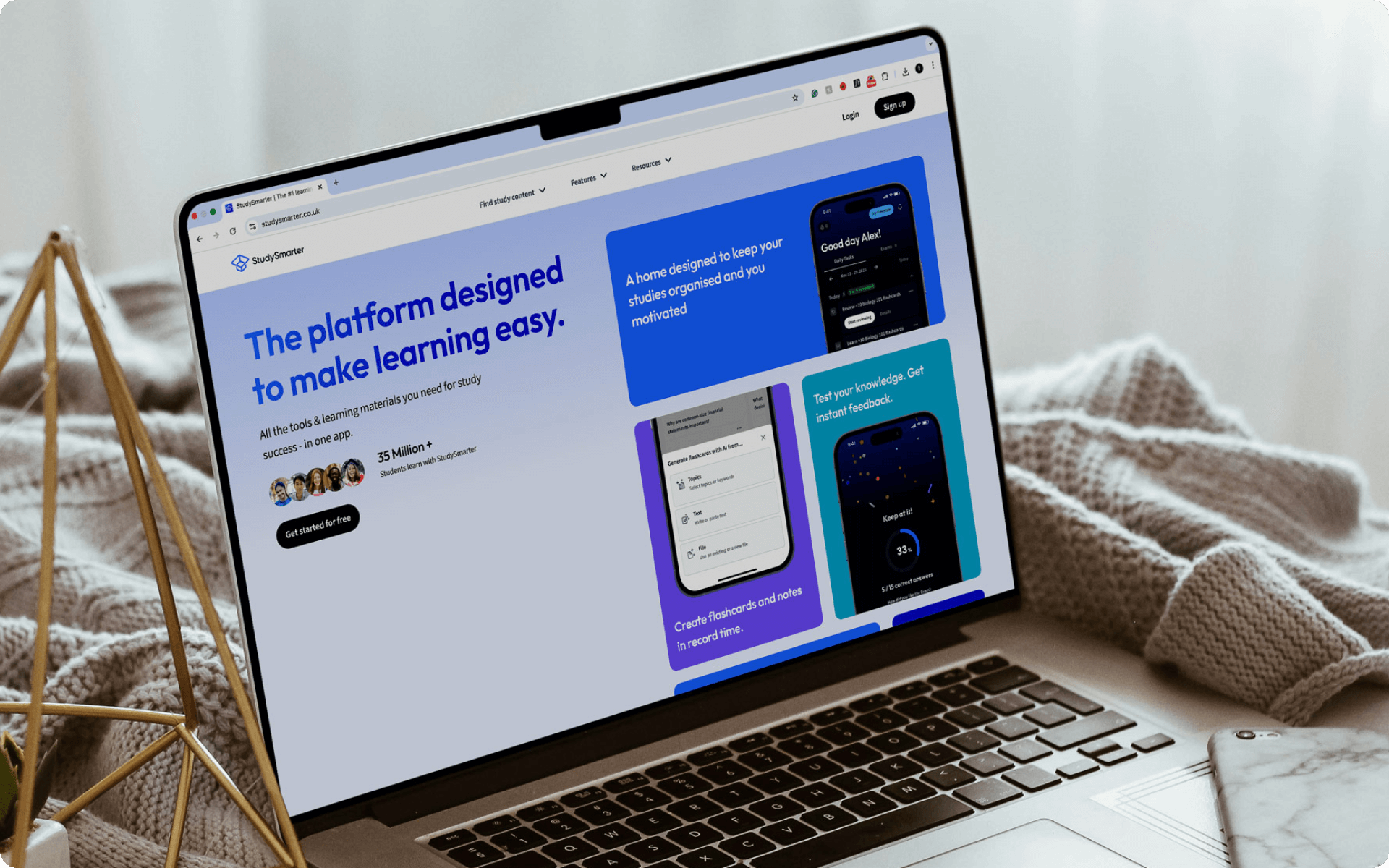
Redesigned the homepage for StudySmarter | Vaia with a modern gradient visual style and an increase in conversions. This redesign was aligned with a wider redesign of the product (learning platform and app).
My role as the Creative Lead was to define a visual style for our marketing website that complemented our new product.
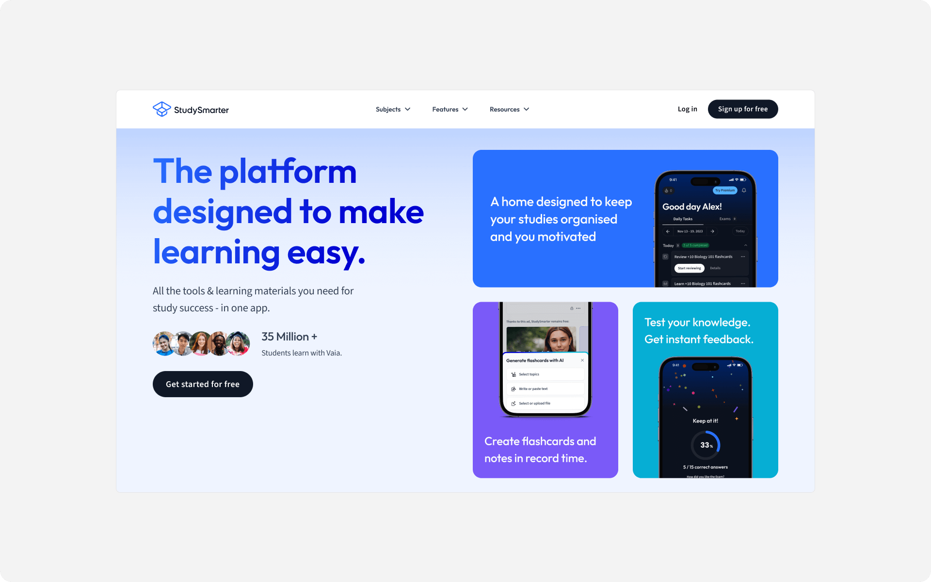
The most visible element on the page and the highest converting for our brand, and for most brands, is the hero section. I spent a lot of time exploring the above-the-fold section of the homepage (hero section).
This included content creation, wireframing and ideation focused on promoting our new product and features. Following this, high-fidelity designs, visual exploration and handoff to devs.
A key challenge I faced was promoting the product's features within the hero section. The StudySmarter | Vaia platform offers a comprehensive learning experience with many features. I focused on making students' lives easier as the key value proposition and benefit to the user.
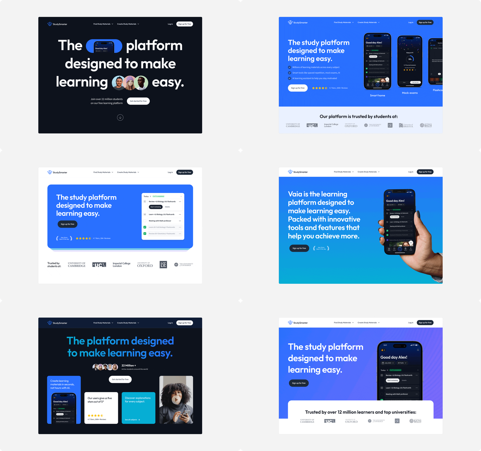
Visual Direction 01
I curated the hero sections (shown above) with the StudySmarter | Vaia Co-Founder. They gave feedback on the content messaging and potential of the visual directions. When reviewing, we focused on directions that were visually stunning but also had the potential to be high-converting.
Direction one focuses on clear communication around our product features with a key brand gradient for visual interest. The visual strategy here was to show our product in the context of real student environments.
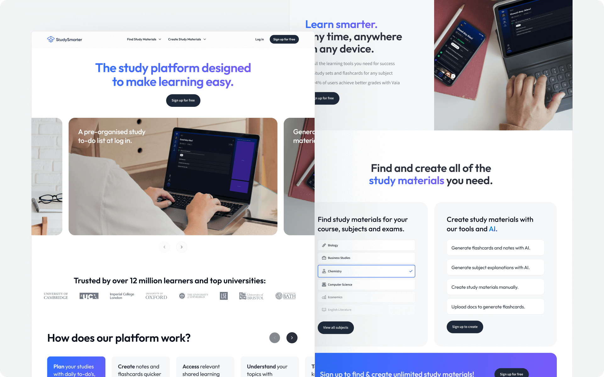
Visual Direction 02
Direction two leads with a single brand colour. This is used to highlight key pieces of information or draw attention to a specific section of the website, such as the hero. The direction prioritises showcasing the interface of the product and how the platform works.
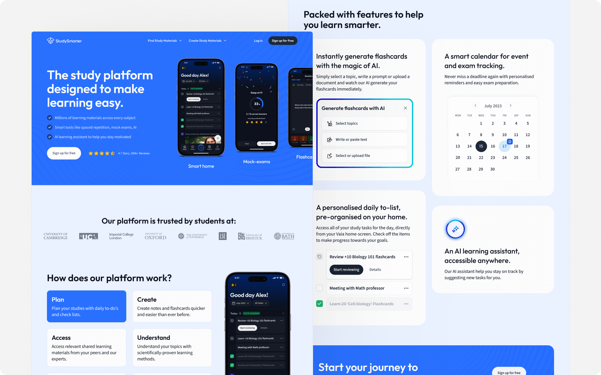
Visual Direction 03
Direction three takes a bold, modern and tech-focused approach. It uses 'dark mode' and a brand mesh gradient for a strong visual impact. This was intentional to position StudySmarter | Vaia as a cutting-edge learning tool for modern students, not a dated learning platform.
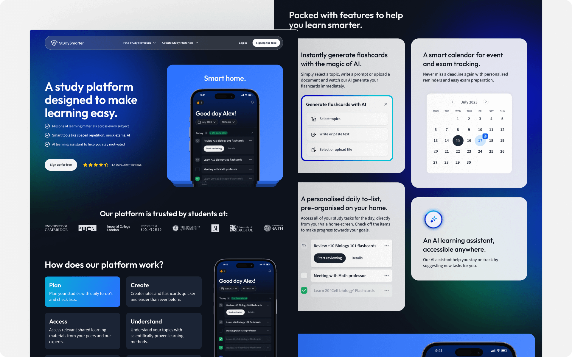
Finalisation
Discussions with stakeholders were held to finalise the direction. This included curating the best elements of the directions to become the final visual style. Visually, we used the core brand blue and gradient with accent colours to bring balance to the design.
The final homepage takes a 50/50 split on desktop. The core value proposition is shown as sticky on the left with a dynamic scrolling content section. This enabled the design to show the top-level value whilst promoting the core product features and including social proof.
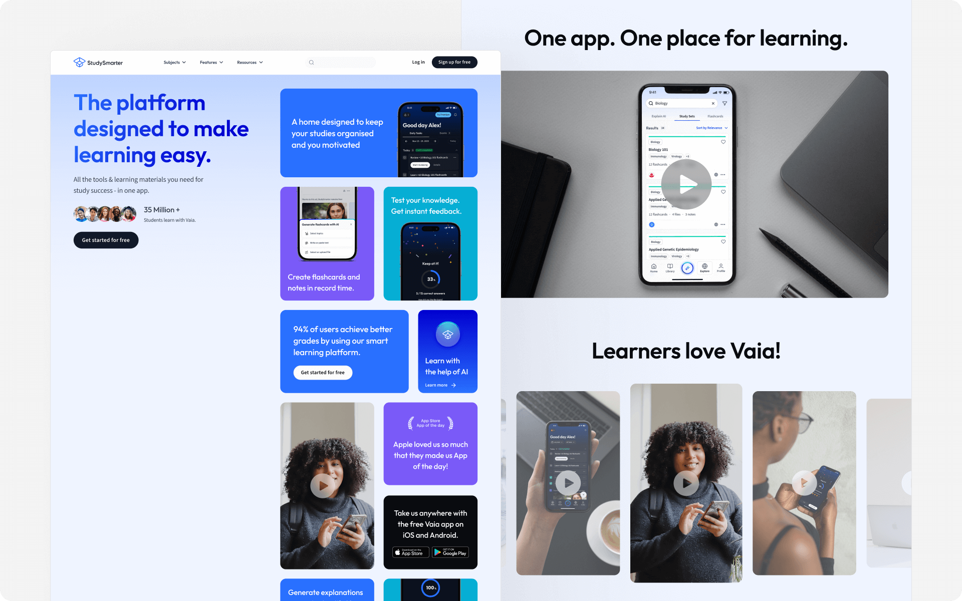
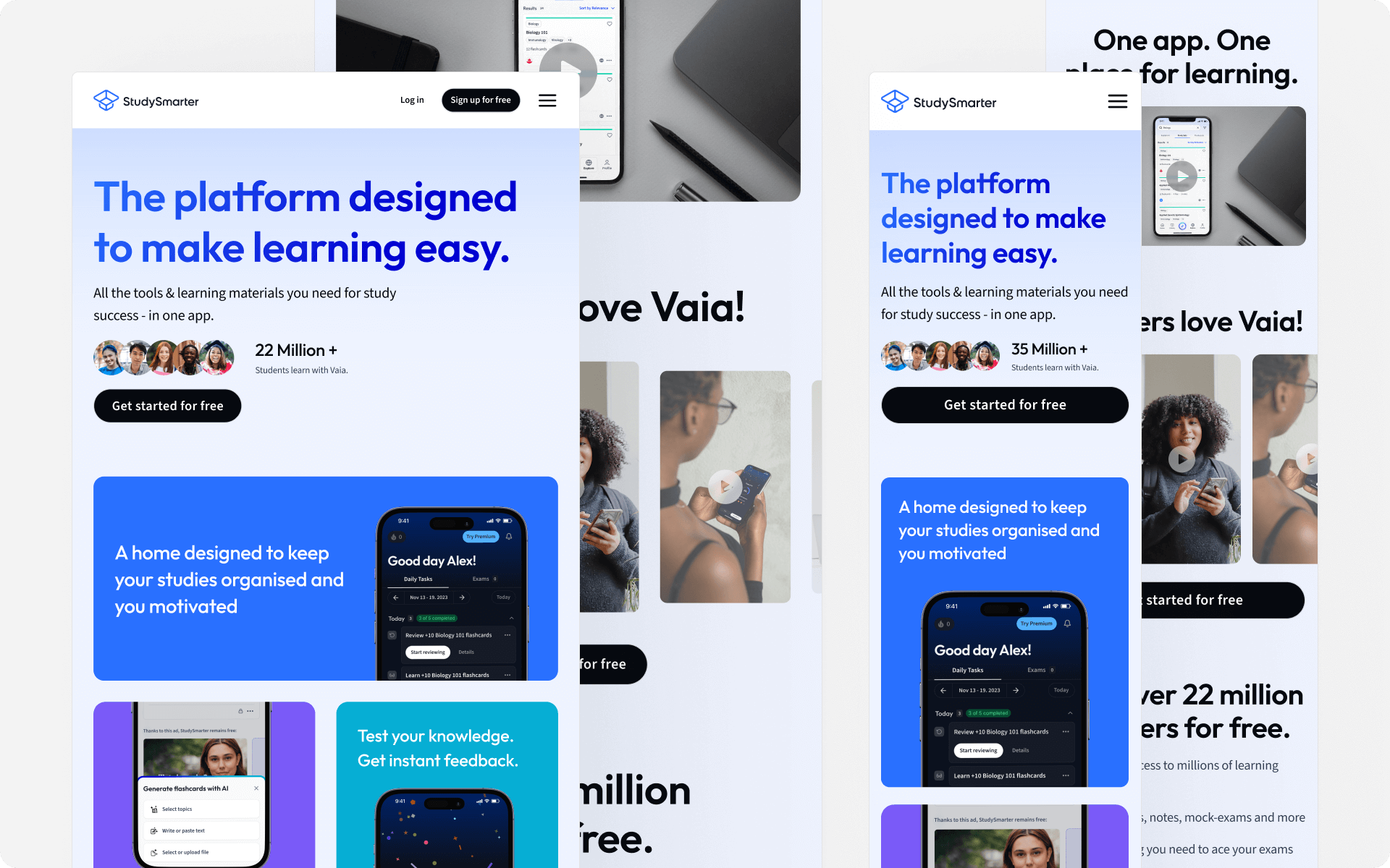
The final homepage design was successful. It had significantly higher conversion rates than our previous design. Additionally, it enabled StudySmarter | Vaia to move forward confidently into a new phase.
You've made it this far, why not say hello?
© joeyowst.com 2023. All Rights Reserved.