
ARTICLE PAGE REDESIGN
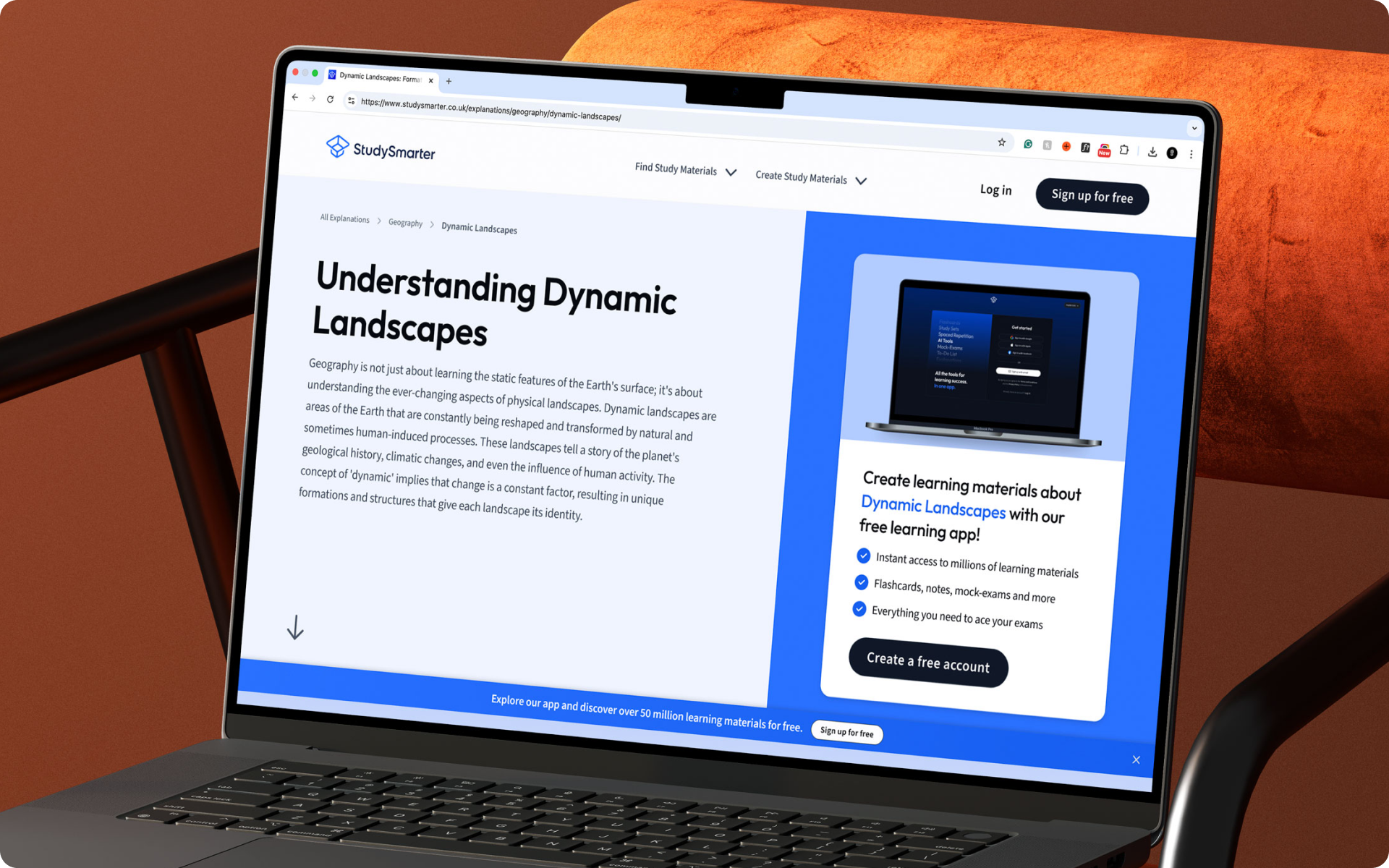
The long-form article template powers 80% of UK, US, and DE traffic for ed-tech learning platform StudySmarter and Vaia. However, the old design suffered from high bounce rates, poor mobile usability and limited content scannability.
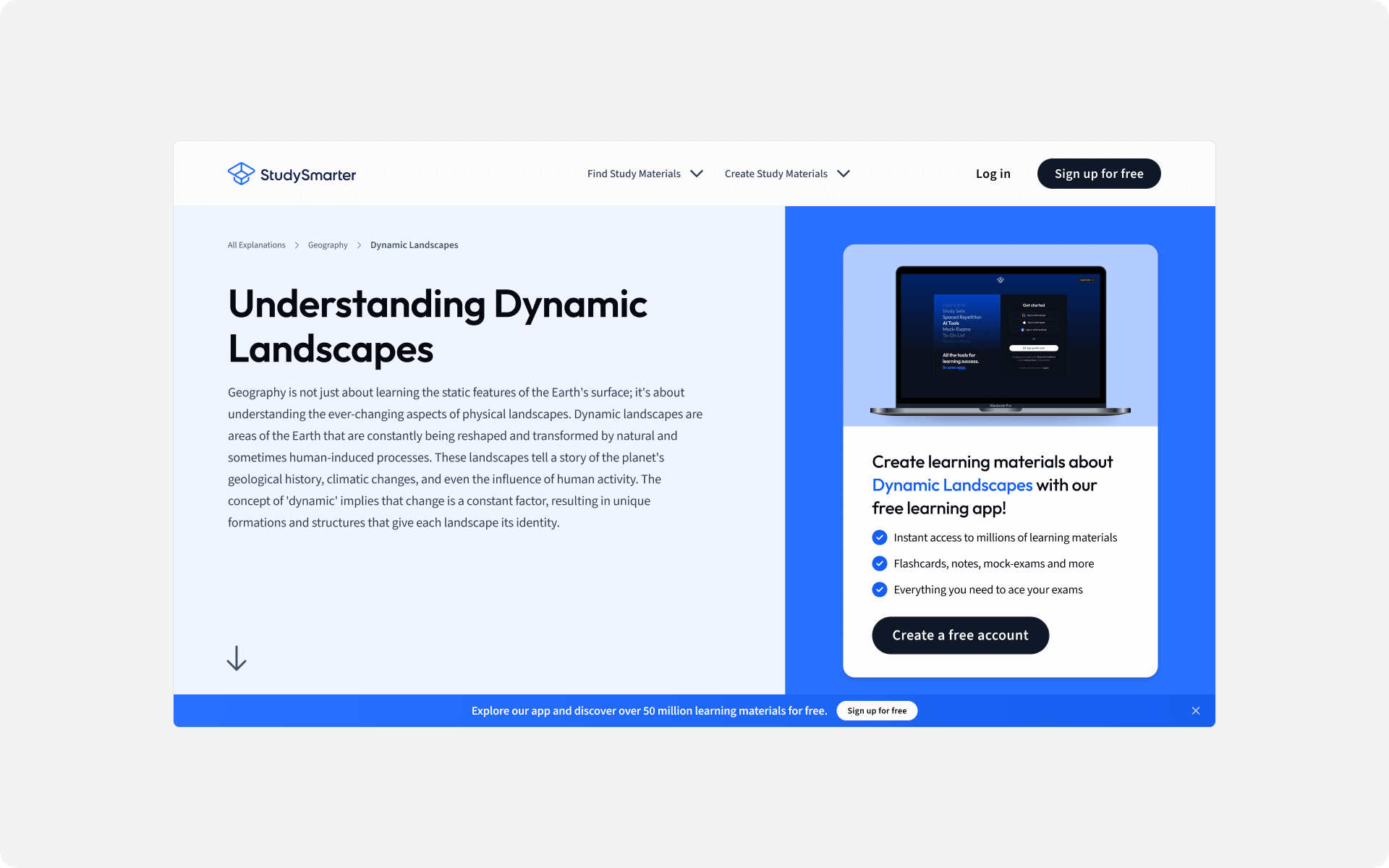
My goal was to modernise the template design to improve reading flow, enhance SEO structure, and increase conversions, without disrupting thousands of existing articles.
I started the process by aligning with key stakeholders from SEO, Growth/CRO and C-level to understand what needs to remain, be removed or be changed.
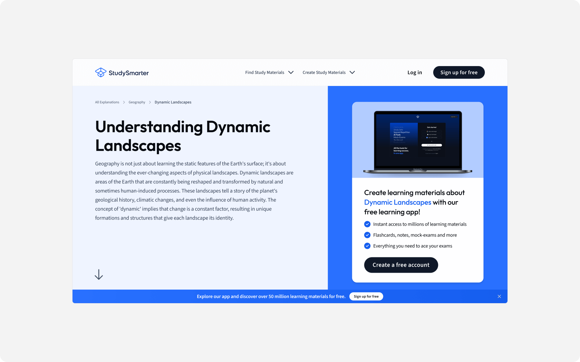
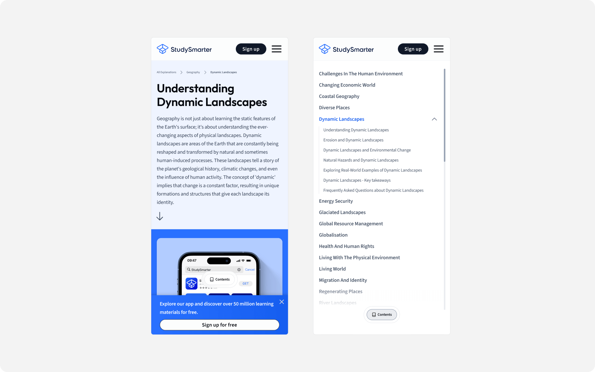
A key element that needed to remain was the app promo in the hero section, pictured below.
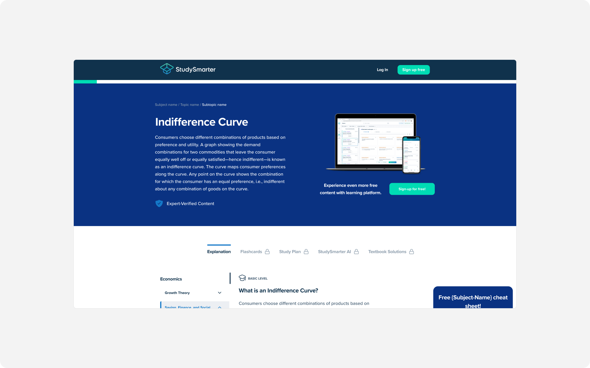
I separated the hero section content from the Banner/CRO element. This gave better visibility to both elements and improved conversions.
This split also provided a better mobile experience. Enabling the content to easily stack ontop of one-another.
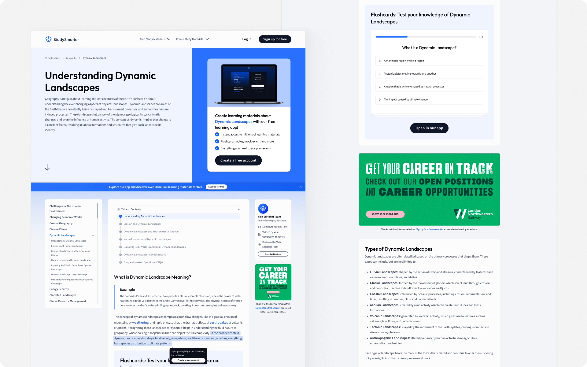
The page included a three-column layout. A left sidebar for navigation, a mid-section for content and a right sidebar for author info and ad placement.
The content included text styling elements for call-outs, quotes and other key pieces of information. A flashcard learning quiz was added to bring interactivity to the page and match the function inside the StudySmarter mobile app.
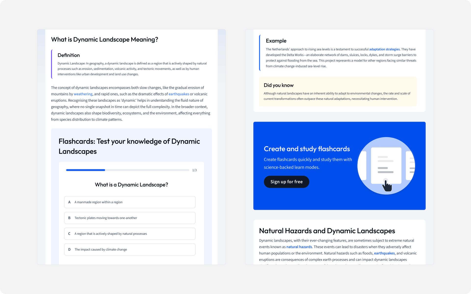
Overall, the redesign was successful. The page UX was improved with a focus on content readability for the user. The total number of conversion elements on the page was reduced, but still increased overall page conversions.
You've made it this far, why not say hello?
© joeyowst.com 2023. All Rights Reserved.